Monday, June 30, 2014

Lattice Card

Hiya, Crafters! Thanks for stopping by. I hope everyone is having a good start to their day. It had been a busy weekend as my husband's grandparents and little cousin came for a visit. It was great to see them. Today I was inspired to make a lattice card for my husband's maternal grandmother. I wanted to send her something to brighten her day.


Here's what you'll need:
  • Cardstock cut to 6 1/2 x 10"; scored at 5".
  • Two (2) pieces of cardstock cut to 4 3/4 x 6 1/4"
  • Patience
  • Double sided tape
  • Paper trimmer 
  • Scissors
  • Versamark
  • Embossing powder and heat tool
  • Sponges
  • Stamping and die cutting tools
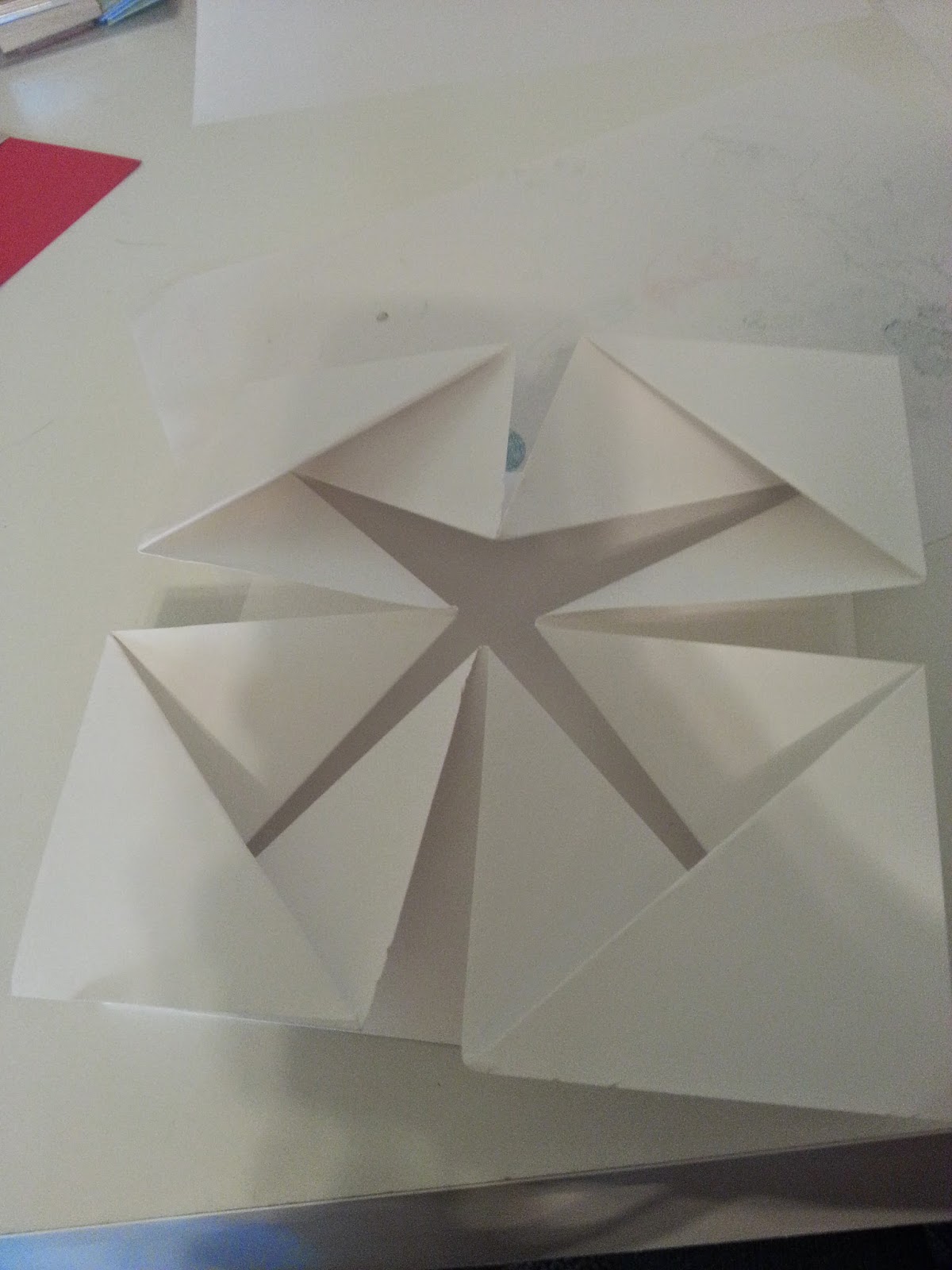
Let's get started. If you have to write anything on the back of the base card do it now.  Take your 4 3/4 x 6 1/4" piece of cardstock and cut out the center. I used the largest rectangle in the Spellbinders Nestabilities Scallop Large Rectangle. Next you will be cutting many strips of cardstock to make the lattice behind the opening. I cut mine close to 1/4", but yours can be as thick or thin as you like. Around the rectangle I surrounded it with tape, use the strongest that you have. Then arrange the strips of card diagonally, or horizontally, over the cut out shape.


Once you've got that done, gently weave the rest of the strips going in the opposite direction.

Don't worry about the excess, you can trim those off with scissors once you're done.

You'll want to attach this to your base card once it's been cleaned up. The reason why I did is because it was starting to stick to the paper when I applied pressure. Then decorate as you like. The effect I did with the flowers is that I stamped them with versamark, poured clear embossing powder over the image. Once I set the powder, I sponged over the image with ink. Sometimes I used multiple inks for a cool blending effect. Once that was done, I went over it again with a clean part of my sponge so that the embossed lines would pop more. I used make up sponges.

That's it. I hope you enjoyed this tutorial. I also hope your crafting is not interrupted with tornado sirens like mine was. Thanks for popping by, Crafters. See ya soon!

Thursday, June 26, 2014

Tunnel Card

Hiya, Crafters! Thanks for popping by. I hope everyone is having a good day. It's absolutely pouring buckets here and the lights have flickered. The only good thing about this is that Oscar, my male cat, hasn't bothered me to take him out on a walk. He can be very persistent. 

Today I wanted to try making a tunnel card. They look complicated, but they're quite simple. I got the instructions from Dawn's Stampin' Thoughts - again, It was a quick card as long as you pay attention to what you're doing.


Let's get started. Here are the materials that you'll need:
  • Two (2) pieces of cardstock cut to 5 1/2 x 8 1/2"
  • Cardstock cut to 4 x 5 1/4"
  • Two (2) pieces cut to 1 7/8 x 5 1/4"
  • Paper trimmer
  • Scoring tool
  • Bone folder
  • Stamping and die cutting tools.
On your first piece of cardstock score in half at 4 1/4" and set this aside. This is the base of your card. (If you stamp the back to sign do it now.) Take your other piece of 5 1/2 x 8 1/2" cardstock and score it at 2 1/8", 4 1/4", and 6 3/8". (Or you may flip the card over and score the other side at 2 1/8". It's the same.) 

Before you fold your score lines you will want to cut out your center first. I used Spellbinders Nestabilities Labels One, the 4th one up from the smallest. I lined the points up with the 4 1/4" score line. Tip: If you don't have magnetic plates, you can use a post it note or washi tape to keep the die in place.


Don't emboss them and save the cut out piece. Next, I folded the score lines in the mountain fold and stamped an image on the label that I cut out. Set this aside.


Take your 4 x 5 1/4" cardstock and fold in half or score at 2". You'll be adhering this over the middle score line on the base of your cardstock. The easiest way to do this is tape just one half of the paper and align it against the score line on your base and stick down. Then tape the other half and fold your base cardstock over so it adheres naturally.

After that I took the mountain fold panel and ran tape on the outer most panel and aligned it up with the outer edge of the base of my card. I then smoothed it out flat and fitted the label that I cut out in the same area I cut it from. If you haven't stamped your greeting yet, do it now before you tape it down.

 
Then I taped the outer panel and folded the base of the card over.  So when you open it, the peak of your mountain fold is facing you and the label is glued to your base card. After that it's just a matter of gluing your two 1 7/8 x 5 1/4" panels. 

The front of the card panels measure to this: 4 x 5/4" and 3 3/4 x 5". Decorate as you please and adhere it to the front. That's it! You've made quite the unique card!


The materials used for this card are:
  • Cardstock from Michaels
  • Sale-a-brations DSP from their spring 2014 sale.
  • Pool party and calypso coral ink
  • Word Play Stampin' Up stamp set.
  • Hero Arts stamp set for the outside greeting and balloon.
Hope you had a fun time making the card. Let me know what you think in the comments below. Thanks for popping over. See ya soon!

Wednesday, June 25, 2014

Scallop Tag Topper Punch Card

Hiya, Crafters! Thanks for stopping by. Happy middle of the week! I just found out that my niece has gotten her first apartment with a friend. I'm very proud of her. So today I am going to show you how I do a scallop tag topper punch card. I fell in love with the look on pinterest and just had to get the punch. I don't know if you've noticed, but I make slightly larger cards than most. I still do the standard, or little, size occasionally; but I prefer a bit bigger. You can find the smaller measurements here with a video as well.


Let's get started! Here's what you'll need:

  • Scallop Tag Topper Punch
  • Cardstock cut to 6 1/2 x 10". This is the base of your card.
  • Outside layer 3 x 6", and 2 3/4 x 5 3/4"
  • Inside layer 4 3/4 x 6 1/4"
  • Baker's twine
  • Paper trimmer and scoring tool
  • Stamping, embossing, and die cutting tools
To start, cut your base card stock to size. Flip it longways and notch the top and the bottom at 3 1/4. You can notch with your scoring tool or you can mark it with a pen as it will be punched out anyway.


Once you've done that you're ready to punch out the scallop tag topper by lining up the notches with the very top point of the tag.


Once you've punched those out you will need to cut the flaps out. On your paper trimmer, line of the punched line with the groove. You can either drop your trimming blade into the void of paper, or slowly move it up until you feel the give. You will want to move slowly. Once you've cut out both flaps, bring your scoring tool down and score the flap.


Flip it around and cut the flaps out as well but don't score. This is going to the be the front of your card. The tag topper that you did score go ahead and fold. You will use that edge to line up and score at 5".


Adhere your layering panels. I like to stamp on the lower right corner on the inside layer as it's a peek-a-boo. Once you've glued everything down, thread your baker's twine through the tags and tie it closed.

Materials used for this card:
  • Cardstock purchased from Michaels
  • DCWV designer paper
  • Paisley Cuttlebug emobossing folder. (My nieces name is Paisley!)
  • Yippee - Skippee stamp set from Stampin' Up!
  • Chalk Talk framelits from Stampin' Up!
  • Key stamps - I can't remember the brand.
I hope you enjoy making this card as much as I do. Please leave a comment of what you think. Thanks for popping over. See ya soon, Crafters!

Tuesday, June 24, 2014

Z Fold Card

Hiya, Crafters! I hope everyone is having a good day today. I'm going to send another card to my BFF whom we thought had broken her ankle, but it turns out that it was just the worst possible sprain one could get. I just want her to know that I'm thinking of her.


Here's what you'll need:
  • Cardstock cut to 6 1/2 x 9 3/4". This is the base of your card.
  • 8 1/2 x 11" piece of cardstock for your bottom layer.
  • 8 1/2 x 11" piece of decorative cardstock
  • 3 3/4 x 5 3/4" white cardstock
  • Paper trimmer
  • Scoring tool
  • Stamping and die cutting tools
First you'll want to score your base cardstock along the 9 3/4 length at 2 3/4" and 5 1/2". For the first panel the layer measurements are 2 1/2 x 6 1/4" and also 2 1/4 x 6". 

The second panel the layer measurements are 2 1/4 x 6 1/4" and also 2 x 6".

Lastly, the largest panels measure at 4 1/4 x 6 1/4",  4 x 6", and 3 3/4 x 5 3/4".

For the greeting I used Spellbinders Nestabilities Classic Squares Large. I found one that surrounded my greetings and just went up for layers.

I hope you have fun making this card. Post pictures in the comments below if you like. Thanks for stopping over. Bye!

Monday, June 23, 2014

Napkin Fold Card

Hiya, Crafters! Today I am going to show you one of my favorite cards to make, the napkin fold card. I really enjoy these types of folding cards, they come out so neat and whoever you give them will love it. They're always a hit. I found this tutorial a couple of years ago by Dawn Griffith. She's a lot of fun to watch and easy to follow. I go to her for a lot of inspiration.


Materials needed:

  • (2) 12 x 12" cardstock, one for your base, and the other for the triangles.
  • Paper trimmer
  • Scoring board
  • Bone folder
  • Sponges (optional)
  • Stamping and embossing tools.
For the Belly Band:
  • 2 x 12" piece of cardstock
  • 1 3/4 x 12" piece of cardstock.
  • Velcro dots or 3D foam
  • A greeting to close the gap
For the envelope:
  • 10 x 10" paper
  • Envelope punch board or scoring board with diagonal plate.
Let's get started! Take your base 12 x 12" piece of cardstock and score at 3" and 9". Rotate 180 degrees and score again at 3" and 9". Move your piece of paper to the 6" line and mark the center of your paper at 6".


Fold all sets of 3" and 9" score lines both ways. Take the corner point and fold to the dot that you made in the center of your paper. Do this on all corners and fold them all both ways.


 Fold in at the 3" and 9" score lines and fold the corner into a square. You will do this on all sides.

Once you have the squares, you will take that center point and fold it backwards.


 Now all that is left is to decorate! Take your other piece of 12 x 12" cardstock. I'm using the Stardust Stack from DCWV.  You will want to cut out a 5 1/2 x 5 1/2" square and cut that into four triangles. You will want to cut point to point, then cute again through the point to make it four.

Next I cut out two (2) 5 1/4 x 5 1/4" square and cut point to point, and then cut those in half to have a total of 8 triangles. Cut both pieces the same. You will have a total of 16 triangles.

The next two steps are completely optional. I sponged every score line in ink. Then I sponged the same color ink over the edges to cover the white cardstock.

For the center the measurements are 5 3/4 x 5 3/4" and the stacked layer is 5 1/2 x 5 1/2". Take your four large triangles and glue them on the large triangles on your base cardstock. Then do the same with the 16 smaller triangles. Embellish as you find necessary.

For the belly band I used the 2 x 12" cardstock and layered it with a coordinating color cut to 1 3/4 x 12". When you wrap it around your card, you will see the gap. To close the gap cut out a greeting. Here I used the Chalk Talk stamp set and dies. Once I centered it I glued it on to one side of the belly band. Now if you choose, you can adhere the side with glue or adhere both sides with the 3D foam stickers and shimmy the band over your card to keep it closed. I found that to be a pain in the butt so I used Velcro dots instead.


Voila! Aren't you fancy?
The card is 6 x 6" total. For the envelope you will want a piece of 10 x 10" cardstock. I know that the envelope punch board disagrees, but with the belly band you will want the extra space. If you don't have the envelope punch board, you can score this out on your scoring board with the diagonal plate. The score lines are 4 1/2", turn paper, 4 1/2" turn paper, 4 3/4" turn paper, and 4 3/4". Just cut out the little triangles to make folding easier and tape the paper together.

Thanks for reading! If you make one, please post a picture of it in the comments. I'd love to see what you make! See ya later, Crafters!

Post It Note Holder

Hiya Crafters! I hope everyone had a good weekend. Mine was pretty laid back aside from preparing for the visit from my husband's grandparents at an undisclosed date. I found that I have a lot of post it note pads. I think they're great for jotting down an address to post a card to someone or writing up your menu for the week to come. But they can make my space seem cluttered.  I searched through Pinterest for a resolution and found this tutorial. What I liked most about it out of the tons that I found is that I could flip it around how it opens. From top to bottom or side to side. I decided to do it side to side because I love books.

Materials needed:
  • Cardstock cut to 3 1/2 x 7"
  • Cardstock cut to 3 x 3 1/4"
  • Postage stamp punch
  • Embossing folder
  • Paper trimmer 
  • Scoring board
  • Stamping tools
Once you've cut your paper to the sizes needed we need to ink your embossing folder and run your paper through your embossing machine. I was a little nervous when I first inked my folders because I was afraid of the clean up. It's as easy as running your embossing folder under the faucet. It's that simple. Unless you use staz-on ink. I used a bunch of make up remover wipes and a lot of elbow grease to get the majority off of my folder. But that's neither here nor there. I don't have a brayer, so I took my ink pad and "stamped" the folder. Up and down, up and down. I didn't paint it or smear it on because it comes off as smeared on your paper. I used a gears and cogs folder from Cuttlebug. I love steampunk.

Next I took some cream colored cardstock and stamped out my letters. The stamp set is the Morning Post Alphabet from Stampin' Up!. The ink I used was pacific point. I punched out the letters with the Postage stamp punch and inked the edges with crumb cake to give it a vintage look. If you choose not to use a punch and want to layer it again, the size would be 2 3/4 x 3". You can definitely add more embellishments to take it from average to glamorous.

Fold along your score lines, roll some tape on the back of your post it note pad, and stick it on your newly made holder. That's it! Now you have a nice looking holder that takes care of the clutter on your stand.

Thanks for stopping by, Crafters! See ya soon!

Saturday, June 21, 2014

Nurse Owlette Thinking of You Breast Cancer

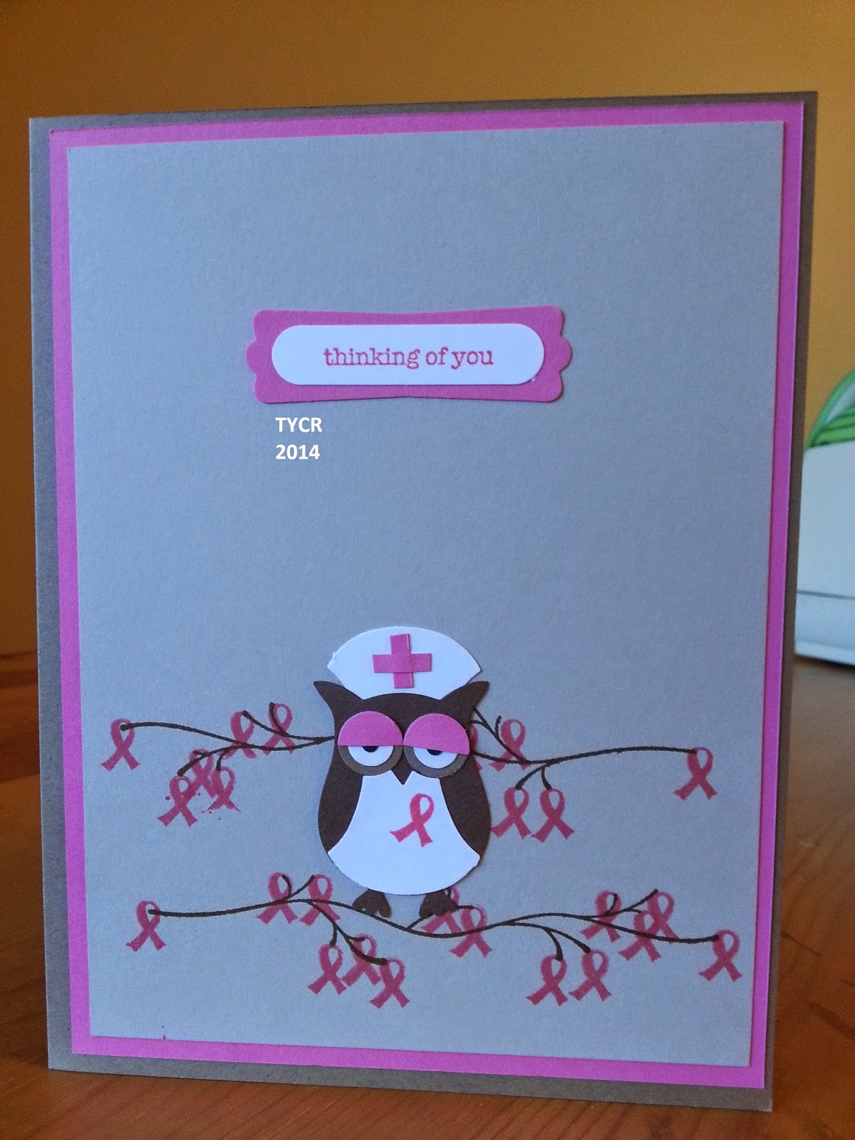
Hiya, Crafters! Thanks for popping over. Seems like a lot of people I know lately are having surgeries or breaking things on their bodies and need Nurse Owlette. I have a very special cousin in Florida who had breast cancer and needed a double mastectomy. She is such a champ. On her first round of getting her implants, she had a reaction to it and had to stay in the hospital for a couple of days, but she pulled through. Anyway, she will be getting her last implant on Wednesday and I'm sending her Nurse Owlette.


The card base is my standard size of 6 1/2 x 10". The layers are 4 3/4 x 6 1/4" and 4 1/2 x 6". This time she has eye shadow, which I cut the largest hole in the owl builder punch in half and glued it atop of her eyes. Instead of covering the branches with flowers or leaves, I chose tiny pink ribbons, which also replaced the heart on her chest. Inside layer is 4 3/4 x 6 1/4".


Materials used:

  • Owl Builder Punch
  • Modern label punch
  • Word window punch
  • Teeny Tiny Wishes stamp set
  • Support the Girls stamp set
  • Adhesive
  • Paper Trimmer
  • Bone folder.
Let me know what you think in the comments below! Have a great day and Happy Crafting!

Friday, June 20, 2014

Stair Step Card

Hiya, Crafters! Thanks for popping over to see me. A friend of mine recently had her first baby and I was inspired by this card for her. Luckily I already had the stamp set and coordinating dies. It was meant to be, right? Today I will show you how to make a stair step card.


Here is what you'll need:
  • Cardstock cut to 4 1/2 x 12" for your base of any color.
  • Cardstock to match base cut to 4 1/2 x 1" (Don't cut this bit just yet.)
  • Cardstock of your choice cut to 4 3/8 x 1 3/8"
  • 15 pieces of cardstock cut to 1 3/8 x 1 3/8" of any color or multiple colors.
  • As many pieces as you wish cut to 1 1/4 x 1 1/4".
  • Paper trimmer
  • Something to score with
  • Scissors
  • Glue
To get started you will want to score the base of your card at 1 1/2", 3", 4 1/2", 6", 7 1/2", 9", & 10 1/2".  Rotate your cardstock 180 degrees and score at 1 1/2" & 3".

Place your paper in front of  you. You'll have a checker board of 1 1/2 x 1 1/2" squares. From the top left count out to three squares. On that third square mark it, mark the one next to it, and the next after that. The middle center square under those top three need to be marked as well. If you play Tetris, you'll recognize the shape!

You will want to cut that out with scissors and toss it. Next I snipped the paper to create flaps which will later be your stairs. Only fold those flaps and the center bottom one. For now, we're ignoring the 10 1/2" score.

Don't fold the other score lines as it will make your card tend to bend more. The only reason why I know this is because I did a template first before using my nicer cardstock. Now you're ready to start building the stairs. Simply roll your tape on one side and adhere the other side to it. I did this to both sets of flaps. This is the top of your card!

Because the bottom of your card does not have an overlap, I had to create a hinge. I took a piece of 4 1/2 x 3" paper. This you will later trim down to 4 1/2 x 1", but you will want to score it first because it gets tricky to score something at a 1/2" when it's only an inch wide. After you've scored it and trimmed it down to 4 1/2 x 1" glue one side with the crease facing out. Then you'll line up the opposite side and adhere that to the other side of the hinge.


There you go! You now have a base of card to decorate as desired. I went ahead and did the baby block thing. There are 15 squares that need decorating and the bottom as well. Always do a dry run because I changed my mind a few times after placing the paper down. Especially if you have cute distractions like my cat Ginger.


Decorate as you like. You can put big, 3D decorations, bakers twine, bling, anything you like! The bottom of the card, where you stuck the 4 3/8 x 1 3/8" is where I signed the card. You can sign it anywhere you like. The back will be open. I chose to put my "signature" there. You can also stick a little gift back there, like a gift card or maybe roll a onesie or cap tight and fit it in.

This card does lay flat to mail. It's a 4 1/2 x 6" card. If you have the envelope punch board, I would use the 4 1/2 x 6 1/2" card size to make your envelope as the other was too snug for my liking.


And that's it! Once you get the hang of it this will be an easy and quickly made card. I hope you have fun with it! Thanks for stopping by, Crafters! See ya soon.
Please let me know what you think in comments below.

Supplies used:


  • Something for baby stamp set and coordinating dies.
  • Stampin' Up! trimmer board
  • Ink - Pool Party, Daffodil Delight, and Lucky Limeade.
  • Cardstock purchased at Michaels.
I want to stress that I am not a Stampin'Up! demonstrator, I just use their products.

Wednesday, June 18, 2014

Scrapbooking - The art of spending $50 to showcase a .20 cent picture. :)

Hiya, Crafters. Thanks for stopping by. Tonight I'm going to discuss scrapbooking. I love scrapbooking! What do I love more than scrapbooking? Creating the memories. There are so many creative outlets for this kind of memory keeping and I'm sure you already have a few ideas. Kids, pets, marriages, vacations, day to day life, and buying a new home to give some examples. When I went to my first (and only) Stampin' Up hosted party a group of ladies sat around and talked about how long it was taking them to complete a scrapbook.  One of them said how it took them five years to do just one page for her wedding scrapbook while another said she did a page a month for her son. It was daunting to hear it and I thought "What am I getting myself into?" I can be a little notorious for not finishing projects. Since I was single, did not have children nor my own home, I chose traveling.

I love to travel! I certainly didn't as a kid being stuck 3 weeks with my parents as a teenager. We visited South and North Dakota many times, to visit their friends. And they also dragged me all over Illinois. Once they took me up into Canada where I bought my first stamp. I never thought I would to travel so much until the company I used to work for sent me to the Philippines for 6 weeks, and then later for 4 months. It was so freaking awesome! And that's when I decided I was going to see the world.
Yeah, yeah my eyes are closed. But the view is awesome on top of Mount Pinatubo.

Anyway the very first thing that I found I needed was a cover page (outside of the album). It can be anything from a favorite photo, you, or  whatever strikes your fancy. The main thing you need to worry about is your designer paper. Yes, you can use plain 12 x 12" paper. It's certainly cool. I did. But DCWV has so many varieties, which you can usually find some kind of coupon to get at least 40% off that why should you bother resiting? You can use it for your cards too. They also sell single paper, but I've found that if you go to a non-chain store you get a larger variety of countries and states.  Amazon actually has a craft department which is pretty nice. I got my desk there. I digress. Title your first page with what the whole scrapbook is about. Pretty simple, eh? Here are some all of mine.

Here are some misconceptions I had when I first started to plan to scrapbook - I still needed to go to Ireland.
  1. Not every page has to have the same layout.
  2. You can have more than one photo on one page.
  3. You can have multiple sizes of photos on one page.
  4. Each page doesn't need to flow smoothly into another. A page is a memory. Tell it how it is.
  5. You can have more than one page dedicated to a memory or day.
  6. You can totally use two pages at once to tell a story.
  7. You can use the same stamp sets over and over. It won't be boring.
  8. It's ok to make fun of yourself or your husband/boyfriend/girlfriend/fiance in the scrapbook.
  9. Adhesive really is important.
  10. Invest in a printer. You'll be glad that you did.
  11. Photo paper is important.
  12. It doesn't have to take years to complete.
  13. You don't need to spend $50 per page!
Let's start with #2 as #1 will be shown without me having to specifically address it. ;) I like to cram  more than one photo on a page. I did more than one thing that day, and I'm pretty certain you did too. It lets whoever is looking through your scrapbook vicariously take that vacation through you. It might even have them wish that they had been able to go - or get them planning their own vacation! I think it's fun. And if you have a lot to say about your day or visit, it just speaks for itself.
 
You can have multiple sizes of photos on one page. I like to smack my favorite photo of the memory I'm telling and then place smaller ones around it in any way that strikes my fancy. Always always always do a dry run of how you want the page to look first. You may not like it and need to swap out a picture with another. Or you decide that the smaller picture should have been the larger one. I've done that a few times.
 
Haha! I love sheep! I saw a little lamb hop and my heart melted into goo. Which totally takes me to my next blurb about pages not needing to flow into each other. But ... in a sense they always seem to do so. No one complains and I never heard "OMG I can't believe you had your poison garden photos next to your nature walk of beautiful flowers! Wtf is wrong with you?!" I've never sat back and thought to myself "Amy, you dummy. This just looks chaotic."  It really doesn't matter. Nor do you only have to limit yourself to one memory per page. If you and your family had a blast there and there is just too many awesome photos to pick from, use more. I think I dedicated 4 pages to Warwick Castle, or the Gardens of Powerscourt. Shoot... I dedicated a whole album to my wedding.
 
It's fine to use the same stamp set over and over. I know it's weird that I'm even addressing this because who wouldn't want to? But I've seen on the webs and listened to those ladies at my first stampin' party that they think it would get repetitive. I don't think it does. I do like to use themes. For Ireland I stuck with orange, whites, and greens because those are the colors on their flag. I did the same with the UK, and used only my wedding colors for my wedding scrapbook. You do not have to do that by any means. Use what speaks to you. I used the exact same stamp set for every page. And those flowers? I used them all the time. I'm sure you recognize the banners too. It's all good no matter what you decide to do. Isn't that awesome?

I had a lot of fun making my scrapbooks. Not only did I lose myself for however long I crafted, but it was great to see my memories take shape from something other than a micro SD card, or in a folder on my computer, and Facebook just doesn't satisfy me like that. But I also enjoyed making fun of myself, and my husband. For instance, he forgot his passport and we didn't know it wasn't needed when we drove to Belfast, UK from Ireland. You need one from the states to get to Canada or Mexico so I assumed you would here as well. I shamed him for it. And later I made fun of the weird hairdo I had while I was getting all dolled up on my wedding day. You might have friends who aren't into all this craft business and they're being polite while looking through your album. This makes it worth their while.


Hang onto your brochures and ticket stubs. You'll feel like a pack rat and you may not even need most of them. But there are attractions that won't let you take pictures or use the flash on your camera. Not take pictures? I was distraught about that when we went to Trinity College and I saw the Book of Kells and the long, beautiful library. Or the crown jewels for England and Scotland. I understood afterwards. But I was glad that I grabbed those pamphlets. You can either just shove them in no order with no glue on their own page, or cut out what you want from them.
 
I just cut out a bit of my Book of Kells brochure and used it. And work your paper! This is a page from the magical Once upon a time set. I love it. I really really love it. And it works so well with my memory! People like to see where you've gone and how you got around. Look at all those tickets. Not every ticket was placed on that page. There were some instances that we were really looking forward to and I felt that they deserved their special page. My husband loves Chelsea Football Club, so I gave him his own special page. I have to admit it was a pretty epic day even for me. For me, it was the Doctor Who Experience. It was something that I absolutely adored. And I think I dedicated 4 pages to this. I fangirled so hard. My husband is awesome.

At this point I should bring up glue. I had some heavy stuff to place in my scrapbooks. 2 pound (denomination) coins and casino chips were the heaviest. Hot glue should work, right? Nope. I glued my coins down in my book and I could tell they were still a little sketchy but since they weren't loose I went with it. My dad looked through it, and he likes to touch everything. He's not gentle either because he's from an era where you could bomb his toy truck and it would come out unscathed. He's knocked loose so many things from my scrapbook that I have given up on hot glue and switched to Gorilla glue. That stuff works. It doesn't dry clear, so you need to be careful how much you put on and where you put it on the object. I tend to place a dollop in the center, press it firmly where I want it, and oh so carefully set it aside in my closet and shut the door. Cats, you know? They go everywhere.

Next I'd like to talk about embellishments and those 3D stickers you can get at any craft stores. Bling is pretty. I'm not going to argue. By doing a dry run, you'll see when you've dressed your page up like a street lamp person looking to find emotion. The 3D stickers are great too! If you go to the regular tourist places you will find stickers that would look exactly like your photos. I did with Hore Abbey, Big Ben, Blarney Castle, ect. But the things can get bulky. I don't know if I'm making an issue out of nothing, but it can effect how pages turn and how flat your book closes. Oh! You can get album extenders for all your extra pages. Anyway, I can get a little distressed with how it looks. But I know I should not worry one bit about it.

All right, so I have been raving about designer paper, especially that from DCWV. I would like to point out that there are other brands out there, and there are some with 2 sides. I don't always like that because I feel like I'm wasting paper somehow. But that's not important. You can use plain 12 x 12" paper for a page and it can still serve it's purpose. Mine is supposed to look like the country side from an aerial view of hedgerows and sheep. I basically pulled tufts of cotton from a cotton ball and drew legs under it. Then I used ribbon to try and imitate the hedgerows. I know what I'm looking at, but not everyone does. My feelings weren't hurt.


Do you have a lot of scraps that you just will never use because they are too awkward for anything but the recycling bin? I did a lot. It came from layering the title on my pages. I wasn't even able to salvage them for scrap for punches later on. Not that I was against tossing them in the recycling bin, but I just had so many and they were of different lengths. And I thought, I could use these to make long, skinny banners. Or save them and use them as a lattice for some flowery, patriotic card. It doesn't look too shabby and all I did was cut out a triangle from the ends. (I bet you wouldn't guess this paper is giraffe print in blue!) Also, if you use regular printer paper to print your photos on it will look like crap. You just can't scrimp on this, you need photo paper. I bought a package of 100 sheets of 8.5 x 11" paper and it lasted me two years. You'll figure out how to maximize the most of your paper with planning ahead. Get a printer. No one wants you to spend an hour at the photo kiosk in Walgreens, and neither do you.
 
I don't know about you, but my memory is terrible. I could leave on a 4 day vacation and not remember some of the little things that really helped shape the bigger moment. I kept a travel journal and wrote in it every night at the end of the festivities. I tracked the weather and anything I thought I deserved to put in there. I also used it to tease my husband if he said something horrible, but as a joke. It's pretty funny to us to be able to remember our many inside jokes. It also helps keep the vacation fresh in my mind just from writing it, and if I need inspiration for a page I can always look through it and spark some creativity.

Sorry about the language. I was a little distressed at how cold it was. And I had a cold.
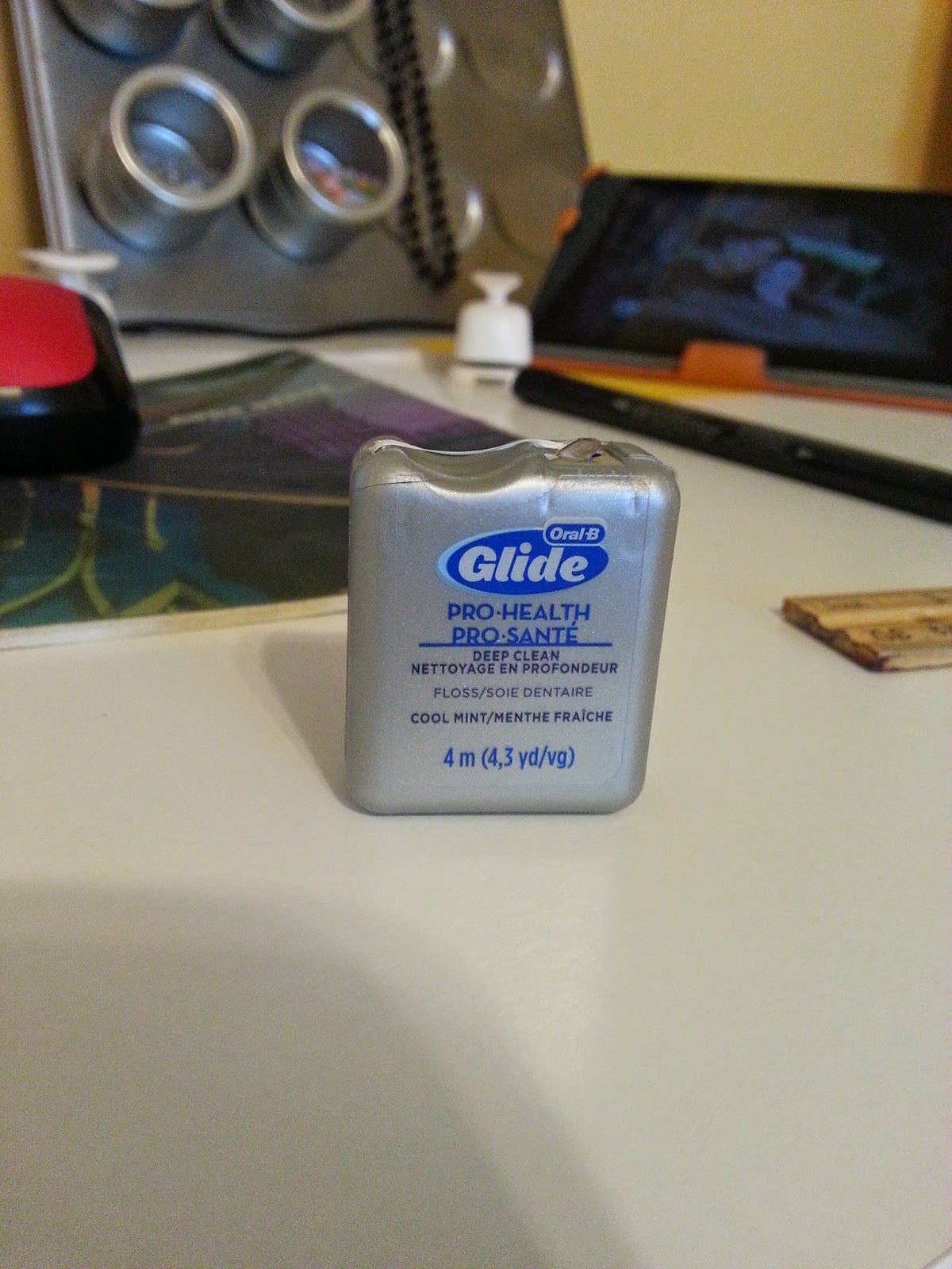
Guess what? You will make a mistake. Sometimes you'll just go with it, and other times you will drop your face into your palm and shake your head. Since you're using permanent glue, it's most likely a permanent mistake. Sometimes you didn't press down hard enough and you can still lift it off of the page. Other times you pressed down on it like you were the Hulk and it made you angry. It's not coming off short of ripping something you won't be happy about. And you might use some questionable language. ;) Never fear! Dental floss will do the trick. No really, it works! You'll wish you had a third arm, but you can shimmy dental floss under the picture or embellishment and it will lift from the page. I was so happy to find out about this trick because I make mistakes!

The last thing that I would say about scrapbooking is don't forget about your album. You can get ones that don't need decoration, or maybe you had something really special to you that you want in your scrapbook but you just don't know how to display it. My Ireland album is bright green with a picture frame. Sure I could have left it at that, but it was .... meh. really, I'm not going to start remembering my awesome vacation with "Man, this album is kinda lame. I wish I had gotten something else." So I made it my own. And my wedding album I added the locket that I hung from my bouquet. That was really important to me as it had pictures of loved ones who had passed away on it. These things certainly serve as a tribute of what really shined out to you.


Well, that's it. I can't really think of anything else to add to this post for ya. Overall, beginning scrapbooking can be expensive, but there are ways to make most of what you have when you have it. Once you get started, the cost will be minimal to just maybe another paper pack and some 3D embellishments. Overall, for my latest scrapbook I spent perhaps $50 in total. And every penny was worth it. 

If I've missed anything that you think is important, leave it in the comments and I'll happily add it. Thanks for taking the time to read this and I hope that I helped you get some creativity for your scrapbook.

Thanks for stopping over, Crafters. Bye!